Dozens 2.0
Designing Dozens 2.0
Rebuilding a financial app around focus and calm
Client: Internal (Project Imagine)
Role: Product strategy, design and experience

The Challenge of 2.0
Navigating an entire financial life on a small screen is never simple. The first Dozens app was designed and hard-coded at speed to get to market, but the next phase demanded more. We needed:
A visual uplift that could evolve the brand
A scalable design system for faster, more consistent builds
Space for more financial planning tools to help people navigate between today, a few years time and the far future
A future proof design that provided obvious places for financial product additions and could also support business or family banking as potential future additions.
Customer learnings and human insights

Customer Insights
Education in flow
The first app organised navigation around Spend – Track – Save – Invest. Users largely ignored sections they didn’t feel were “for them,” revealing that 'the next step' needed to sit inside the journey, not in separate tabs.
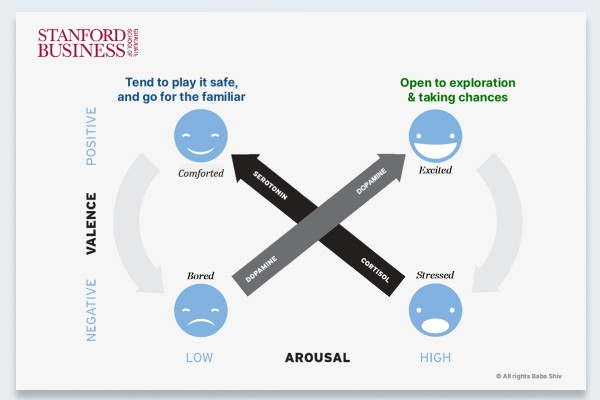
Behavioural Science
Calm enables receptivity

Trends
Search as navigation
Shifts in digital behaviour showed a rise in search-first navigation. As people lean on search instead of folders or menus, we saw an opportunity to rethink how users explore and act on their finances.
Calm through focus
A composed homepage gives users a clear window into their financial life. It highlights only what matters now, then lets them choose the next move. Even when things aren’t calm, the design projects steadiness — offering clear steps to get back on track.

Dual navigation system
The 2.0 redesign introduced a dual navigation model that combined modern discovery with structured control.
Smart Search offered a frictionless way to find products, content, and tools — aligning with evolving user navigation habits.
A hierarchical menu (accessible via burger icon) supported users who still preferred a more traditional mental model.

Natural space for LLM interaction
That early decision to centre navigation around intent rather than category turned out to anticipate what came next. As large language models emerged, the smart search button became a natural home for conversational, LLM-based interaction.


Outcomes from Dozens 2.0
Owing to solvent business wind-down, the 2.0 version for Dozens only made it to the design stages. Early feedback from our customer community had proved positive.